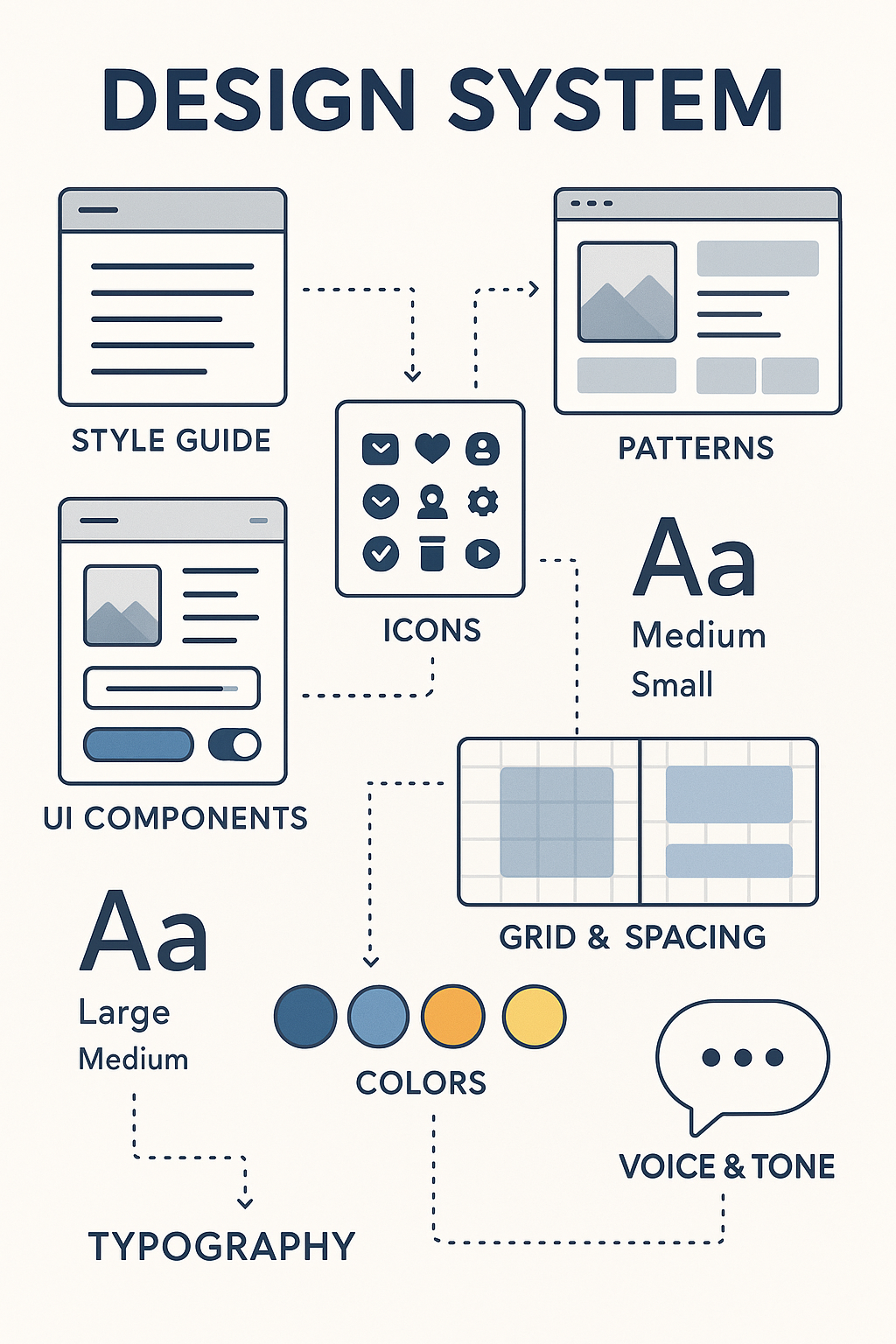
During my work on various product design projects, I've come to deeply appreciate the power and necessity of a well-structured design system. For me, a design system isn't just a library of UI components; it's the living language of a product. It's the meticulously crafted foundation that ensures visual consistency and a unified user experience across all touchpoints. By establishing clear guidelines for elements like typography, color palettes, iconography, and interaction patterns, a design system dramatically streamlines the design process, allowing me to focus on solving complex user problems rather than reinventing basic UI elements. This not only leads to faster iteration and development cycles but also fosters a cohesive and trustworthy brand identity that resonates with users. My approach to design systems emphasizes scalability and maintainability, ensuring that the product can evolve seamlessly while retaining its core visual and interaction DNA.
Core Contributions
- Modular UI Components:
I collaborated on creating a library of flexible, reusable components designed with clarity, user experience, and scalability in mind. These elements formed the foundation for a consistent interface across products. - Visual Style Guidelines:
Defined key design elements like typography, color palette, iconography, and layout spacing. These ensured brand consistency and visual alignment across different teams and touchpoints. - Design Tokens:
Maintained a shared set of design tokens (via SCSS/JSON) to bridge the gap between design decisions and development implementation, keeping both aligned and efficient. - Interactive Map Standards:
Established best practices for integrating and designing map-based interfaces—covering interaction patterns, accessibility considerations, and visual do’s and don’ts.
Tools & Technologies
- Figma:
Main tool for crafting interfaces, building out prototypes, and maintaining the design system library. - Design Tokens:
Used structured variables (JSON/SCSS) to standardize spacing, colors, and typography between design and code. - Accessibility Testing:
Utilized screen readers like VoiceOver and NVDA to ensure designs met accessibility standards and were usable for a wider range of users.